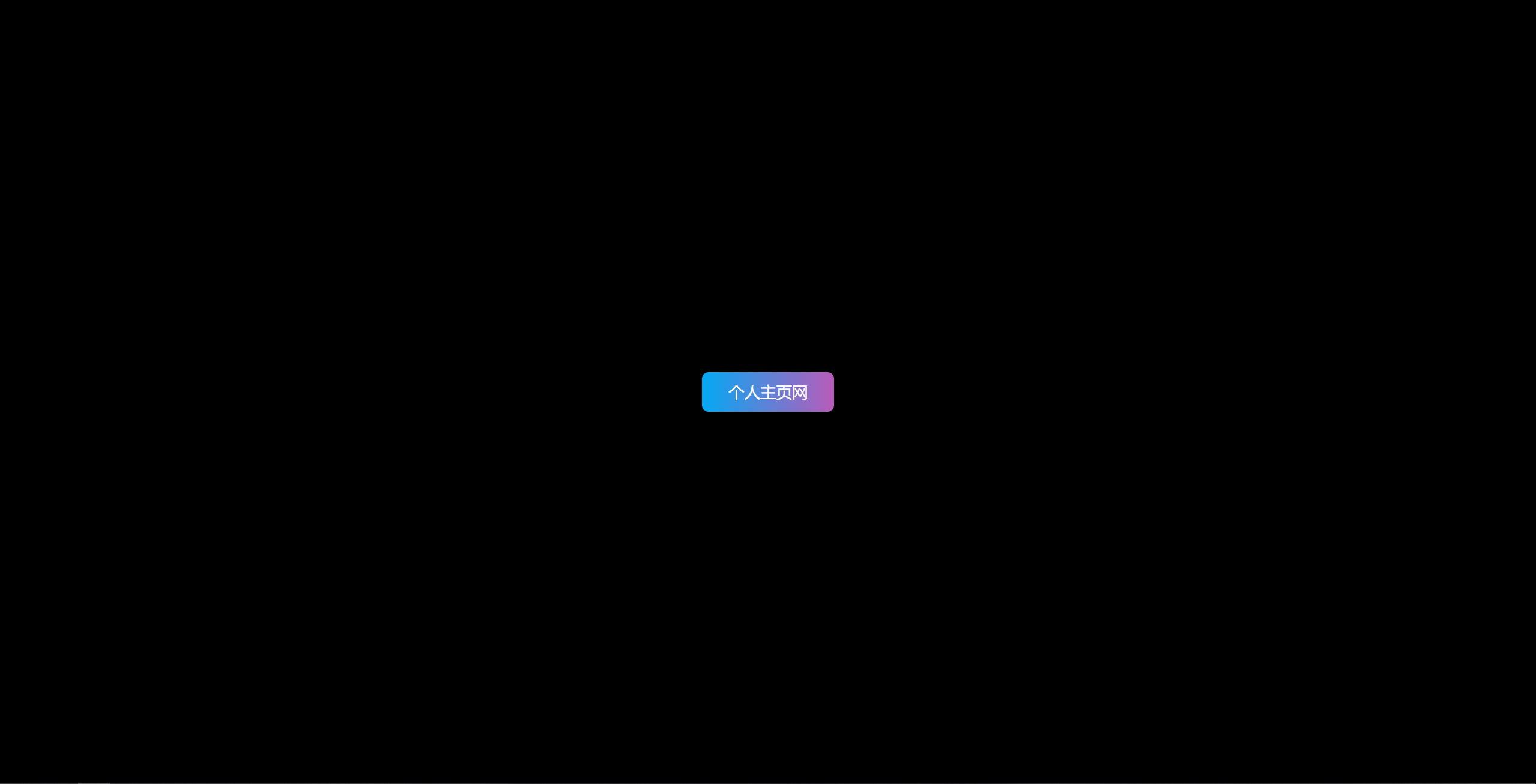
效果预览
代码
| <!DOCTYPE html> |
| <html lang="en"> |
| <head> |
| <meta charset="UTF-8"> |
| <meta http-equiv="X-UA-Compatible" content="IE=edge"> |
| <meta name="viewport" content="width=device-width, initial-scale=1.0"> |
| <title>个人主页网 - www.gerenzhuye.com</title> |
| <style> |
| * { |
| margin: 0; |
| padding: 0; |
| } |
| body { |
| height: 100vh; |
| display: flex; |
| justify-content: center; |
| align-items: center; |
| background-color: #000; |
| } |
| a { |
| position: relative; |
| display: inline-block; |
| width: 200px; |
| height: 60px; |
| line-height: 60px; |
| text-align: center; |
| color: #fff; |
| font-size: 24px; |
| text-decoration: none; |
| background: linear-gradient(90deg, #03a9f4, #f441a5, #ffeb3b, #03a9f4); |
| background-size: 400%; |
| border-radius: 10px; |
| } |
| a:hover { |
| animation: animate 8s linear infinite; |
| } |
| @keyframes animate { |
| 0% { |
| background-position: 0 0; |
| } |
| 100% { |
| background-position: 400% 0; |
| } |
| } |
| |
| |
| a:before { |
| content: ''; |
| position: absolute; |
| left: -5px; |
| top: -5px; |
| right: -5px; |
| bottom: -5px; |
| z-index: -1; |
| background: linear-gradient(90deg, #03a9f4, #f441a5, #ffeb3b, #03a9f4); |
| background-size: 400%; |
| border-radius: 10px; |
| opacity: 0; |
| transition: all 1s; |
| } |
| a:hover:before { |
| filter: blur(20px); |
| opacity: 1; |
| } |
| </style> |
| </head> |
| <body> |
| <a href="#">个人主页网</a> |
| </body> |
| </html> |